Prototype

Motivation
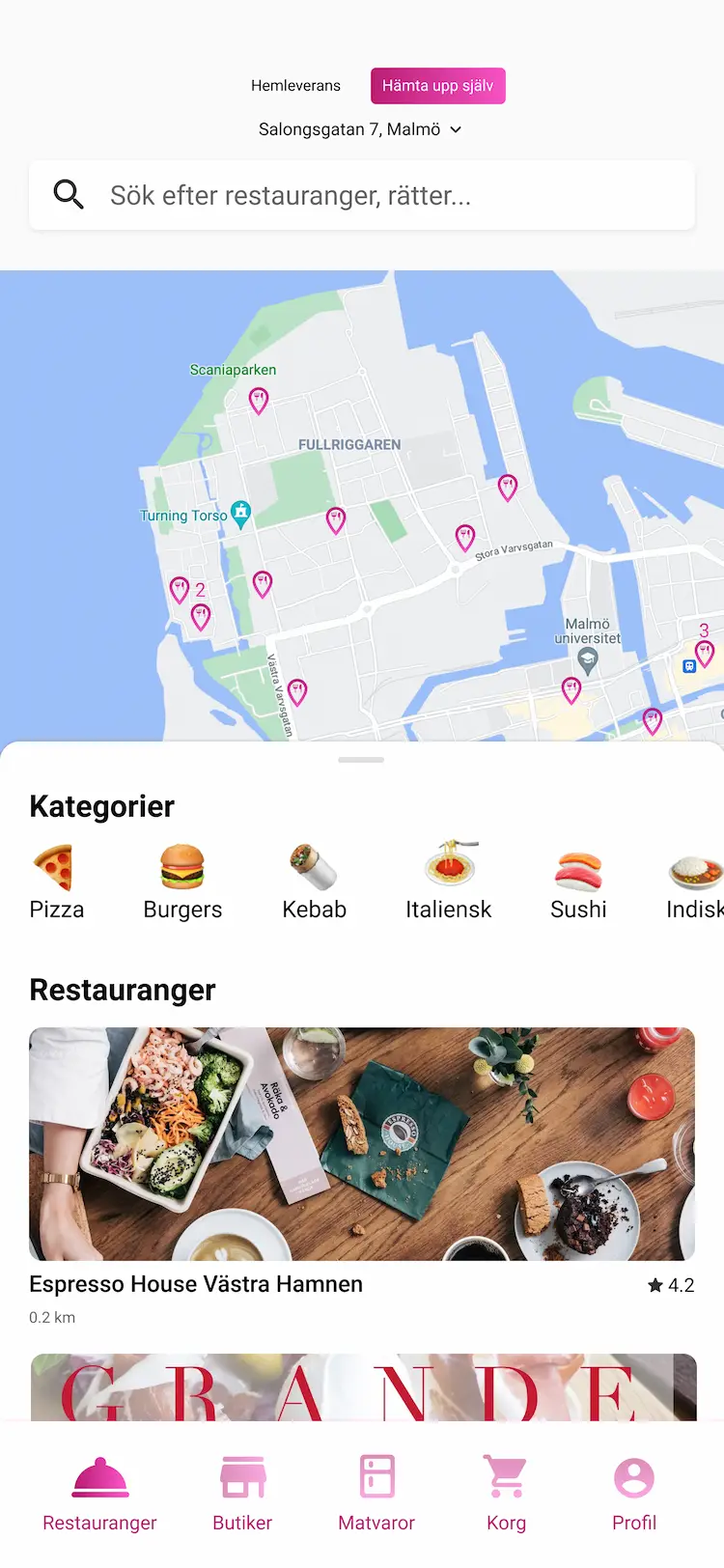
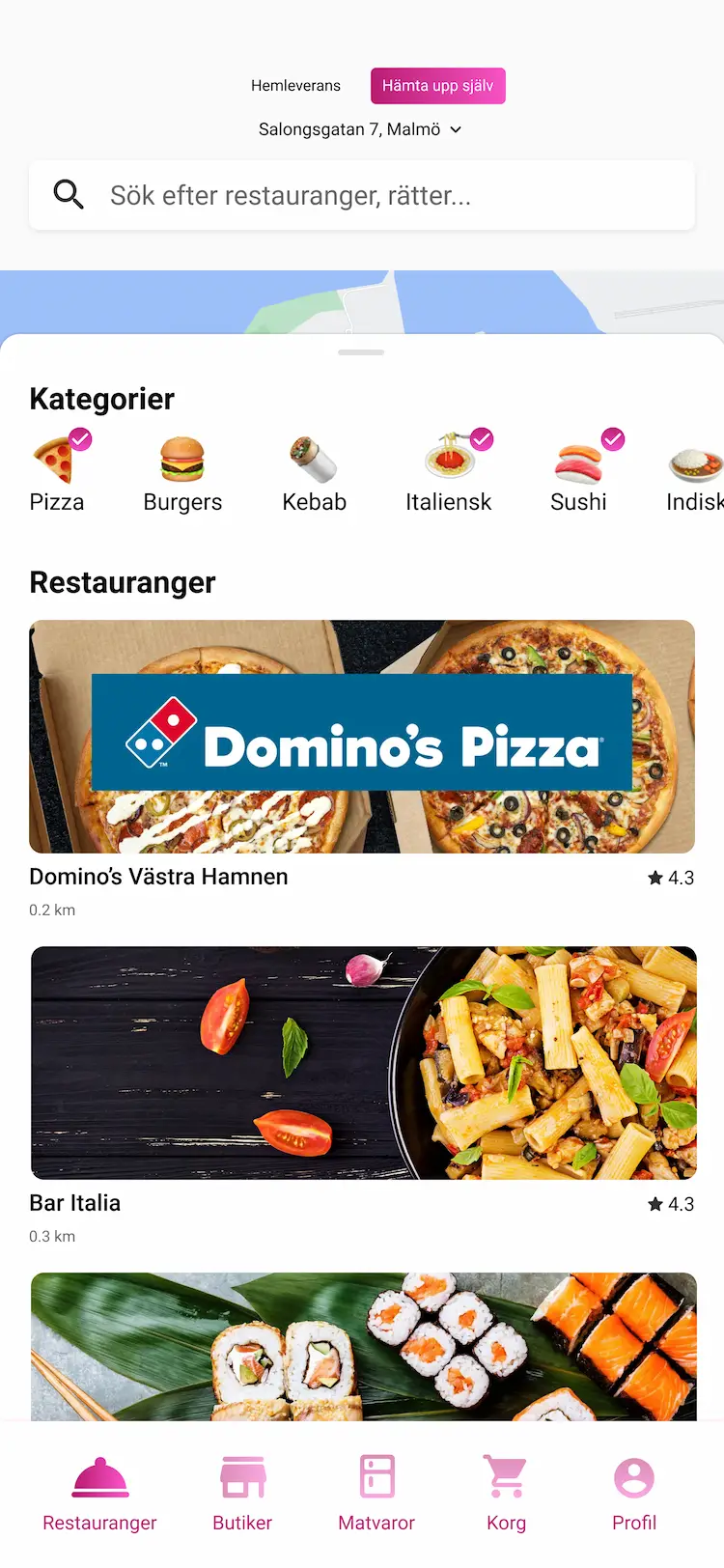
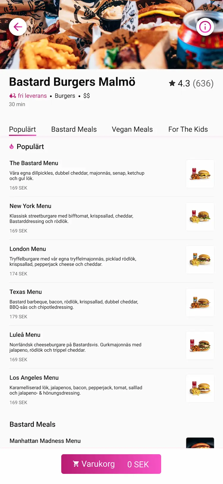
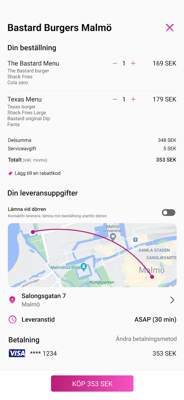
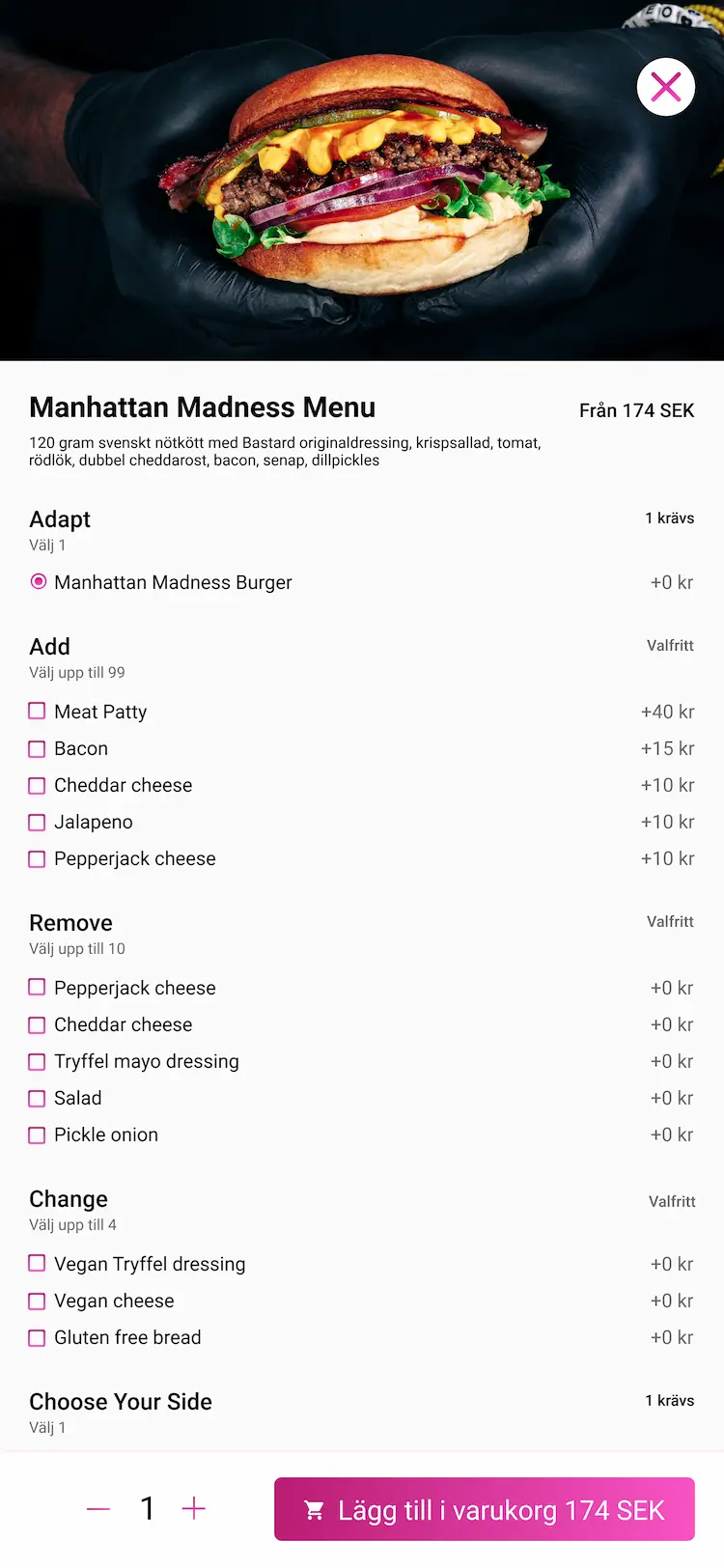
Being a user of Foodora myself, there are parts of the app that I find a bit confusing, and that experience is shared by people I know personally.
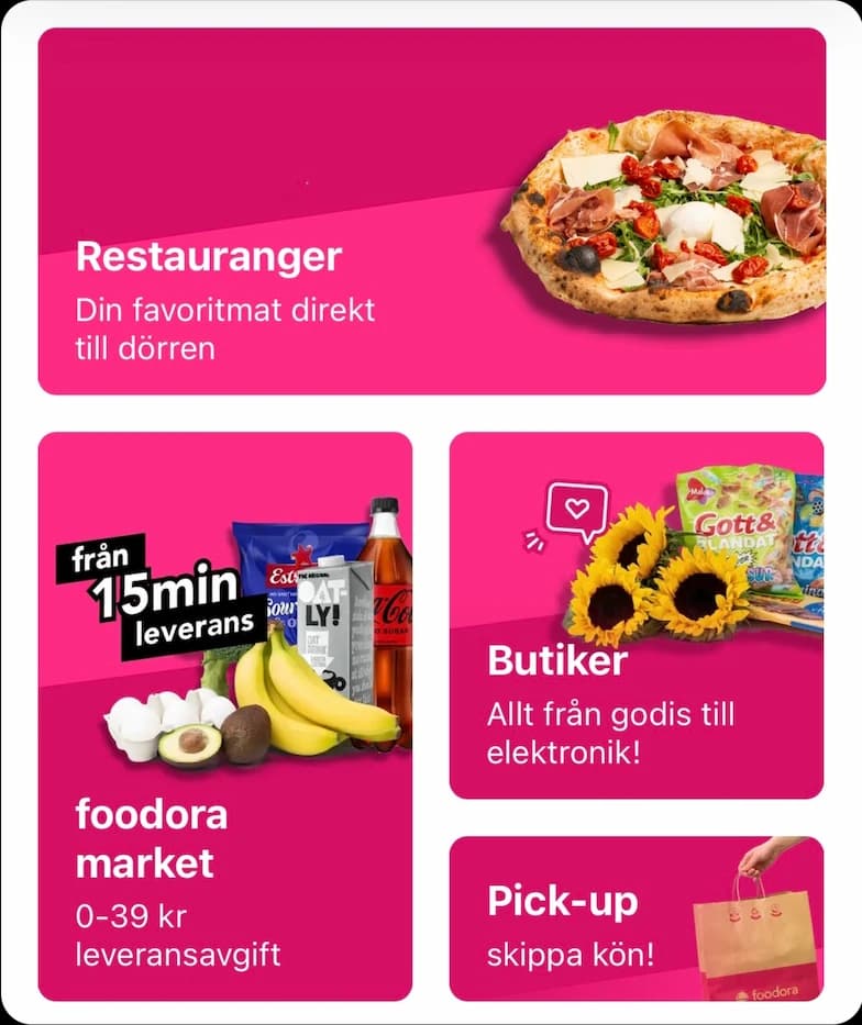
The flow isn't optimal for user experience, because you have to click on the type of service you want to use from the homepage and the layout is confusing. They separate takeout delivery, pickup and store grocery delivery in a grid.
Design system
Similar to the current branding
to keep a familiar look
Roboto Bold
Roboto Medium
Roboto Regular
Roboto Regular
Simple and readable font
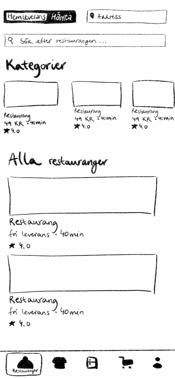
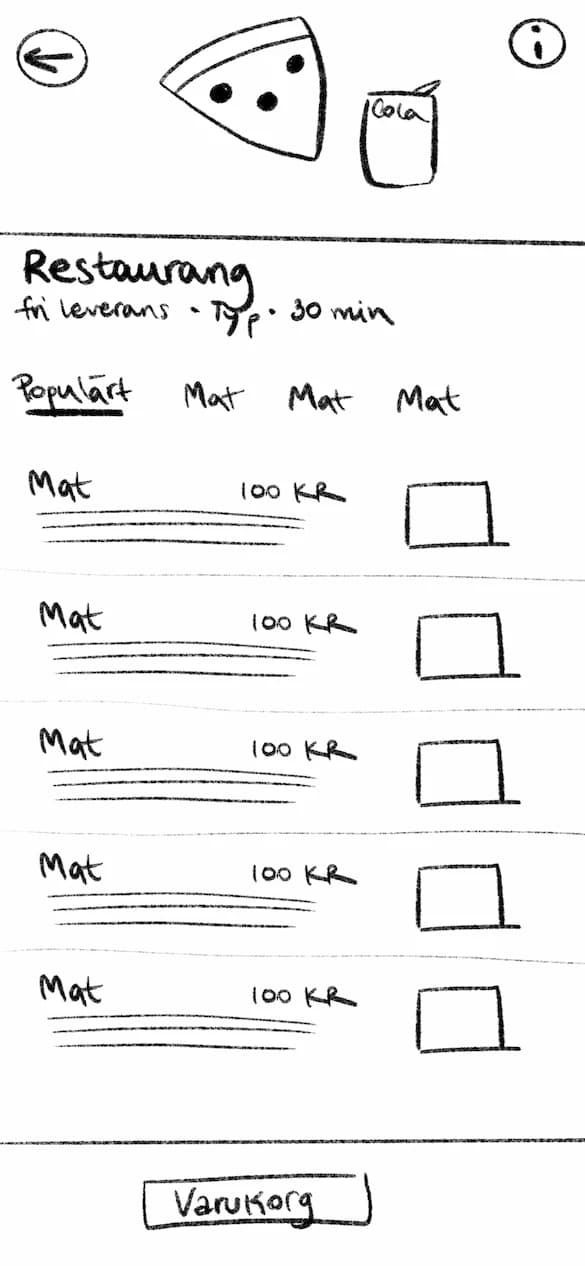
Sketches
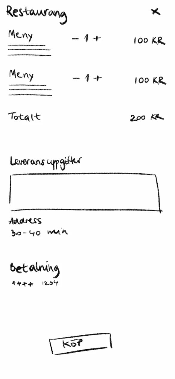
Research
Based on a survey
😕 The way Foodora mixes groceries and restaurants is confusing.
😪 It is difficult to sort restaurant preferences.
😩 It is difficult to navigate around and get back to the page you were on.
🤗 There is a wide audience of all ages.
😋 60% of people use Foodora a few times a month.
Persona

Anna Anderson
Job Title
Real estate agent
Age
25
Social networks
About
- Ambitious, hard-working real estate agent
- Single, Anna has her own apartment in Malmö
- Often gets takeout as she is busy working and doesn't have the energy to make food
Goals or Objectives
- Use an easy to use app for getting takeout
- Quickly make an order without much headache
Biggest Challenges
- Apps that confusingly mix groceries with restaurants
- Takes a long time to figure out how to pick up food
